HeHasTheJazzHands
Well-Known Member
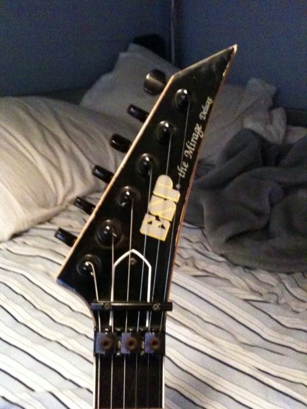
I never knew a logo could make a guitar play horribly. Thank you guys for educating me on this.

This site may earn a commission from merchant links like Ebay, Amazon, and others.
that's so METALI agree, that logo makes me want to vomit.

I never knew a logo could make a guitar play horribly. Thank you guys for educating me on this.

 sorry man
 I never knew a logo could make a guitar play horribly. Thank you guys for educating me on this.
No way I'd pay those kinds of prices for an LTD. I hope this idea backfires on them bigtime.

For fuck's same, they're made in Japan.

I keep forgetting how much a little 2-inch decal on the headstock can piss people off.
I keep forgetting how much a little 2-inch decal on the headstock can piss people off.
It could be made in Japan, and have high quality parts, but GOD FORBID it have a certain logo.
well'dunno if you like the new logo or not,but in case you'd be the first and only to appreaciate it i guessZado: So it's as I feared? All is lost...
I've seen limited shop runs of genuine MIJ ESP Eclipse guitars that had the old blocky logo and it was like a dagger to the retina. An Eclipse/EC doesn't work on a basic, structural level if it doesn't have the handwritten-esque logo.
it doesn't suck too hard,it just doesn't look as good as the old one to me

meh, in 2 years we'll be used to this and no one will make a point of it.
Yes, we'll probably get used to it, but at the moment the new logo is awful and those guitars with the old logo will surely be more treasured because of it.

to be honest, i don't thinks it looks all that bad. sleek modern logo on sleek modern guitars
In my opinion just less character and I dislike they use the same font as on the LTD's.
JESUS CHRIST I WOULD BUY THAT GUITAR IF THE TRUSS ROD WAS LIME GREENLOL! Welcome to the interwebs; the place where you can register your hatred of things that don't matter a whole lot.
They used the same font on ESP and LTD before, why not now?
Maybe it's just me, but when they decided that they wanted to make "ESP" more exclusive, why use the same font?