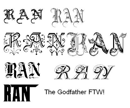
Hey everyone, im going to be ordering a custom 7 string ran soon and at the moment i am just sorting out the last spec details. im currently thinking about the logo and as you all know, the ran logo is a bit cheesy. as a result, i decided to pick my own font. out of all the ones i had the considered, i narrowed it down to these 2.
which one do you think is the best and why?
First
Second
i would just like to get your opinions as i think you may help me decide which one to choose. im really stuck here, i dont know which one to choose.
o yea, i plan to have the logo inlayed with MOP rather than just a decal and the headstock will have a see thru black flamed maple cap (5A to match the body) and will be bound with white binding.
sweeeeeeeeeeeeeeet
Anyway guys, Thanks alot
User01
(btw, i know that i used a 6 string headstock, i couldnt find a decent picture of the 7 string headstock )
)
which one do you think is the best and why?
First
Second
i would just like to get your opinions as i think you may help me decide which one to choose. im really stuck here, i dont know which one to choose.
o yea, i plan to have the logo inlayed with MOP rather than just a decal and the headstock will have a see thru black flamed maple cap (5A to match the body) and will be bound with white binding.
sweeeeeeeeeeeeeeet
Anyway guys, Thanks alot
User01
(btw, i know that i used a 6 string headstock, i couldnt find a decent picture of the 7 string headstock
) Those all suck too. C'mon man. If you're getting something MOP inlaid, make it look cool.