New band artwork

  • Thread starter cenobile
  • Start date
  • This site may earn a commission from merchant affiliate links like Ebay, Amazon, and others.

cenobile

Monkey or...
Joined
Jan 19, 2006
Messages
20
Reaction score
9
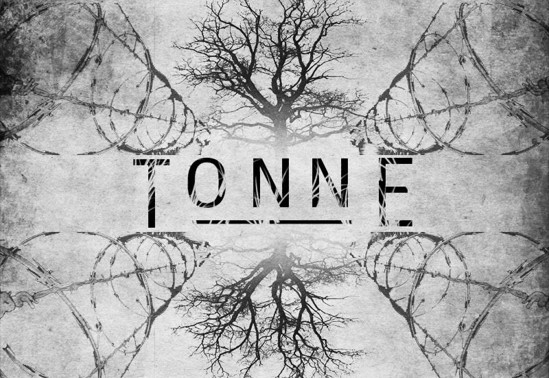
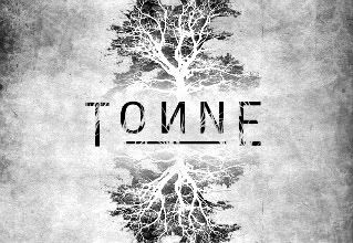
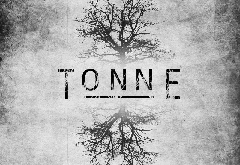
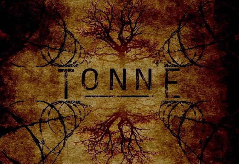
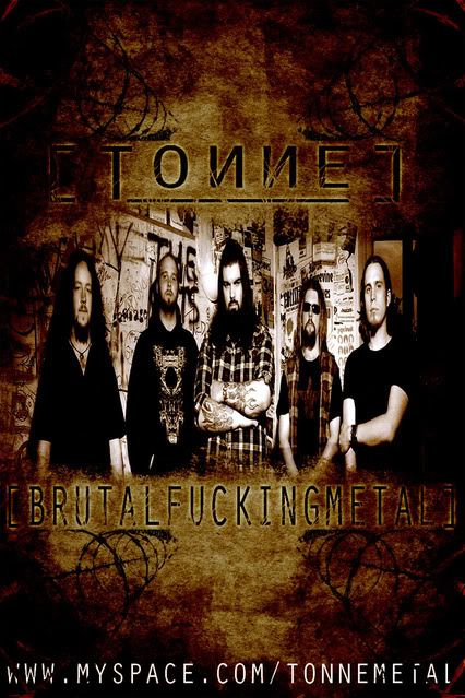
Bands going down a heavier route, looking into Drop A tuning and slowing our material down a touch, kind of rebranding ourselves with our new name etc.

Anyhow, iv done some drafts for logos/shirts/posters etc, just lookin to get some opions on them!

TONNELOGO2copy-1.jpg


TONNELOGONEW2.jpg


TONNEbarwiretree.jpg


TONNEPOSTERcopy.jpg


Cheers :metal:
 

This site may earn a commission from merchant links like Ebay, Amazon, and others.

ShadyDavey

7ibrarian
Joined
Feb 2, 2009
Messages
6,004
Reaction score
903
Location
Peterborough, UK
I like 'em both - can't make my mind up which I prefer although I'm leaning towards the first.

Either works :)
 

MerlinTKD

EIght.Fold.Path / Hinge Theory
Contributor
Joined
May 28, 2007
Messages
2,466
Reaction score
387
Location
Winston-Salem, NC
Definitely like the first one.

The second one is okay, but awful busy... the barbed wire tunnels pull the eye away from the center, rather than towards it (seems like the tree should be the center of focus).

I like the poster, but any time I see a band referring to themselves as "brutal" (or any similar adjective) it makes me think of someone compensation for insecurities. I'd leave the descriptor off, maybe replace it with a song name, album name, some different catchphrase... I dig the artwork though.

Really like the font you used for the band name, too. It all speaks to me of bleakness, desolation, starkness... very cool that it draws up imagery so easily.

I give it all thumbs up! :yesway:
 

Doomcreeper

Whitechapel
Joined
Dec 7, 2007
Messages
435
Reaction score
36
Location
Canada
what if you did the second with the firsts colors, that might look cool

edit: I just took a better look and realized they're pretty much the same, but no barb wire in the first, I think that color with the barb wire would look the best.
 

cenobile

Monkey or...
Joined
Jan 19, 2006
Messages
20
Reaction score
9
Thanks for all your input guys!

@Merlin - i definately see where ur coming from with the barbwire, im thinkng the tree will be the main focus as well. As for the 'Brutal..' tag, its something my band have been adamant about. Personally, im of the opinion that we should drop it, or at least compromise and just have BFM or something. Im gonna try and wear them down and get it off there lol. Thanks again for your ideas dude!

@Doomcreeper: do you mean something like this?
TONNEwhitebartreewire.jpg
 

vampiregenocide

Well-Known Member
Joined
Sep 9, 2008
Messages
16,158
Reaction score
2,106
Love that artwork, shall have to check you guys out :) My fave is the second one. Nice and simple.
 

klami

Well-Known Member
Joined
Dec 6, 2005
Messages
142
Reaction score
36
Location
Norway
Nice work! I liked the first one best, to me it's less busy and it looks better :)
 
Top
')