Rate my band's wallpapers!

  • Thread starter Nik
  • Start date
  • This site may earn a commission from merchant affiliate links like Ebay, Amazon, and others.

Nik

Arrogant asshole
Joined
Sep 27, 2005
Messages
3,248
Reaction score
89
Location
My house
EDIT: It won't let me edit out the old attachments and add the new ones. I'll fix it later today.

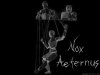
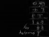
I played waaay too much guitar yesterday so today I decided not to play and I had a lot of time on my hands, so I decided to sit down and make some wallpapers for my band/semi-solo project thing I have going and for my upcoming concept album.

If I'm lucky enough to ever get my CD published, this is the artwork that would adorn the booklet.

I also created a myspace (shudder-yes, I know...) for this project. I realize myspace is gay but this truly is the best way to let people hear my stuff.

Tell me what you think! I think they're fairly badass :yesway:
 

Attachments

  • wallpaper3.jpg
    wallpaper3.jpg
    180.7 KB · Views: 43
  • wallpaper1.jpg
    wallpaper1.jpg
    244.5 KB · Views: 37
  • wallpaper2.jpg
    wallpaper2.jpg
    181.8 KB · Views: 37

This site may earn a commission from merchant links like Ebay, Amazon, and others.

BCrowell

Cubicle Dweller
Contributor
Joined
Apr 8, 2005
Messages
794
Reaction score
21
Location
Eastern NC
I really dig that last one. The first & second just don't seem unique in theme. Regardless I love the artistry put into them!!
 

usagi

more gain please
Joined
Jan 3, 2006
Messages
590
Reaction score
79
Location
Kingston WA
I liked the 1 st one. The other two are cool as well. They seem kind of difficult to see. Maybe invert the colors? Or maybe its just this crappy monitor.
 

darren

Forum MVP
Joined
Oct 18, 2004
Messages
12,821
Reaction score
1,349
Nice drawings, awful typography!
 

Nik

Arrogant asshole
Joined
Sep 27, 2005
Messages
3,248
Reaction score
89
Location
My house
usagi said:
I liked the 1 st one. The other two are cool as well. They seem kind of difficult to see. Maybe invert the colors? Or maybe its just this crappy monitor.

umm then they'd be white and not quite as sinister....

And what's wrong with the typography :fawk:
 

David

je t'aime
Contributor
Joined
Nov 16, 2005
Messages
4,222
Reaction score
86
Location
Issaquah, WA
those are some of the sickest backgrounds I've ever seen, I've saved them, and I'm using the 2nd one right now. Awesome man!:yesway:


Eternal Night, wicked name man:yesway: especially in Latin, represent:hbang:
 

Drew

Forum MVP
Joined
Aug 17, 2004
Messages
33,672
Reaction score
11,294
Location
Somerville, MA
darren said:
Nice drawings, awful typography!

+1. The first and 3rd are awesome. The second doesn't do anything the first doesn't do, and the execution isn't quite as nice, but the artwork on 1 and 3 are devinitely keepers.

The logo, though... My advice would be to redraw that by hand and edit it in in place of the computer-generated one you have now. It looks like what it is - a computer trying to look like a pencil drawing.

I'd also revisit the font for the copyright in the bottom, too- against the pencil drawing in the background, it looks very "fake."

Still though, those drawings are awesome. :)
 

Nik

Arrogant asshole
Joined
Sep 27, 2005
Messages
3,248
Reaction score
89
Location
My house
David said:
those are some of the sickest backgrounds I've ever seen, I've saved them, and I'm using the 2nd one right now. Awesome man!:yesway:


Eternal Night, wicked name man:yesway: especially in Latin, represent:hbang:

I'm honored man :hbang:

Drew said:
The logo, though... My advice would be to redraw that by hand and edit it in in place of the computer-generated one you have now. It looks like what it is - a computer trying to look like a pencil drawing.

I'd also revisit the font for the copyright in the bottom, too- against the pencil drawing in the background, it looks very "fake."

Still though, those drawings are awesome.

:scratch: I took a pen and wrote out the name, then scanned it in-it's not computer generated. I see what you mean about the copyright, though, I'll change that.

And I personally like the 2nd one best-it's one of the drawings I've done I like best, the multi-tiered dummies-controlling-dummies-controlling-dummies thing appeals to me.

Thanks for your criticism!
 

Drew

Forum MVP
Joined
Aug 17, 2004
Messages
33,672
Reaction score
11,294
Location
Somerville, MA
Really? Hmm. I feel pretty stupid now. :lol:

Eh, maybe another crack at it, a little more chaotic this time? I think why it's not quite sitting right with me is the fact it's a muchmore uniform white than the image behind it...

Anyway, if you drew those, they're pretty damned cool, man. :agreed:
 

Nik

Arrogant asshole
Joined
Sep 27, 2005
Messages
3,248
Reaction score
89
Location
My house
Drew said:
Really? Hmm. I feel pretty stupid now. :lol:

Eh, maybe another crack at it, a little more chaotic this time? I think why it's not quite sitting right with me is the fact it's a muchmore uniform white than the image behind it...

Anyway, if you drew those, they're pretty damned cool, man. :agreed:

Ah, OK, I see. I thought about adding a grey layer to make it a tad grey like the pic, but then I decided I really liked the white look. I'll experiment with it later and see how it works.

And thanks. I used to draw a lot before I got a guitar. After that, well, I don't really do anything else. I might make a couple more in the next few days; they're real easy to do.
 

Shawn

ESP • Ibanez
Forum MVP
Joined
Apr 2, 2005
Messages
21,987
Reaction score
3,652
Location
Southern Maine
Cool artwork, Nik, I like them alot, especially the 3rd one, that is cool. :yesway:
 

Mastodon

Songs about My Cats
Joined
Dec 14, 2005
Messages
6,698
Reaction score
261
Location
Bizurke
I like them all. The first 2 would be really good inside artwork. The third would be a really good cover.
 

Naren

OldschoolGhettostyle
Joined
Aug 21, 2005
Messages
19,867
Reaction score
789
Location
Los Angeles
I liked them, but I thought that dummies looked kinda like they were doing ballet in some of the pictures. I think if they were doing something more sinister (like eating another dummy's eye or deboweling another dummy or laughing in a sea of flames), it'd come across as more sinister. I like the name and I like the text and I like the idea behind them all. It's just that none of them strike me as sinister. I just see "ballet." My honest opinion.
 

FredGrass

Serial Chiller
Joined
Feb 7, 2006
Messages
351
Reaction score
11
Location
London, Ontario - even the trees here are metal
I actually dig all of those. I think you should use #3 for the front cover (maybe a bit more centred, too), #2 for the back cover, and just the drawing part of the first one somewhere inside the booklet. That's just my opinion, though. They're sick though dude. GG.
 

Nik

Arrogant asshole
Joined
Sep 27, 2005
Messages
3,248
Reaction score
89
Location
My house
I have updated my first post with improved versions.

Thanks for your comments, guys!

I don't know (or know if I want to) make the drawings more sinister... I mean, I dig your idea, but I don't think a dummy decapitating another dummy would have any sort of relevance to the concept I came up for the concept album :scratch:

I wonder, should I make different resolutions? Right now I only have 1024 by 768 because that's what I use, but I could make bigger ones, too.

BTW if any one of you guys wants some art like this for your own projects, I'd be willing to put some stuff together for you for free if you'd like (unless you ask me to do like 10 drawings :fawk: )

Here's a new wallpaper:
 

Attachments

  • wallpaper4.jpg
    wallpaper4.jpg
    209.5 KB · Views: 5
Top
')