Chris
Forum MVP
(Again courtesy of Rick over at C3G).
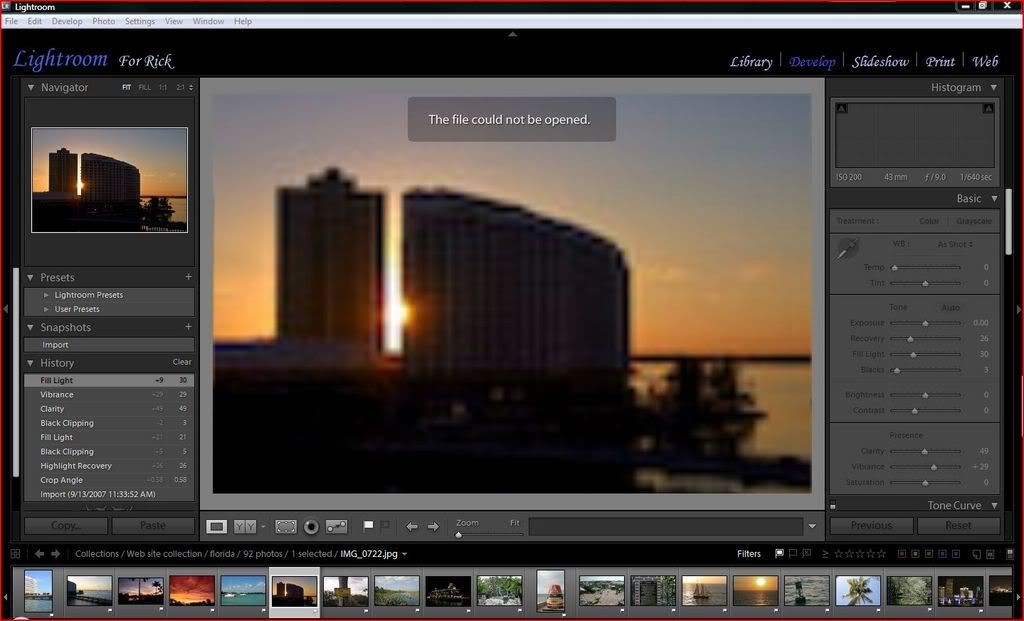
Above is a screen shot of my screen in the develop module. The ony thing you might notice is that I customized the identity plate at the top. To do that, go to Edit > Indentity plate settings. In there you just set it to custom and then type what you want. Editing the text is no different than doing it in any other text program such as Word, Photoshop, notepad...
Adobe Photoshop Lightroom Killer Tips » Customizing Your Identity Plate
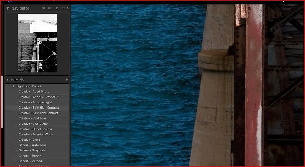
on the left you have 4 fields. The first at the top is the preview. It might seem stupid to have that small preview when you've got that huge working area but there's two very good reasons for that. First, if you zoom in on your main image you can use that preview to navigate around. The second is a nice feature they added into lightroom. Below the preview is a light of presets. You have default presets that come with lightroom and then user presets that you can save as you work. If you hover your mouse over those presets the preview will display what they will look like. This also works the same way when you're using the white balance eye dropper. The image below shows me zoomed in and hovering over one of the default presets. Note the preview is black and white even though my image is still in color. Also note the small box in the preview that is used to navigate around the photo.
if you are working on a photo and fine a nice combination of settings that you think you'll use on future images just click the + to the right of presets and that will allow you to save your settings and give your new preset a name. It will be saved under the user presets.
Adobe Photoshop Lightroom Killer Tips » Monday Video - Loading New Develop Presets
Below presets is the snapshot field. Considering that all edits in LR are soft edits, meaning there are no actual pixles being changed until you export, I really don't think this is needed but I guess someone did. What the snapshot does is to take a snapshot of the image you're editing as it is and saves it at those settings. So if you think you might want to try the image as a black and white after you've spend an hour editing the image you can click the + in that field to take a snap shot of the image and give that snapshot a name. Change it to black and white, continue editing for another hour and when you decide you just don't like it and want to go back to before you changed the photo to black and white you just click your snapshot.
Below the snapshots is the history area. This works just like the history pallet in photoshop. It will save a set amount of edits so that you can step back at any time. Sort of the same thing as the snapshot does only it can do that and more. I believe there is a way to set how many history states it will keep but for the life of me I can't find how. I'll keep working on it.
The bottom of the screen has many things but to be honest I usually have that one hidden. Btw, just like in the library module, you can hide any of the tabs by clicking the small arrows along their edges.
The first icon along the bottom will take you back to the library grid view. Pretty much the same thing as clicking....uh, library.
The second is a pair of arrows. You'd think these would take you forward and backwards through the film strip but they actually work more like the forward and back arrows on a web browser. They take you to the previous or the next view you were in. I can't explain why and again, this tab is usually minimizd so I have never asked.
Next is the folder location and file name. This can be an easy way to find where the photos you are editing actually live and what the file name is. If you actually want to go to that folder, right click on the image and choose show in explorer.
Down to the right are all the filter icons. There all work the same way but will filter the images you are working on depending on how you want to filter them and how you originally labeled, flagged or rated them. The first three are the flagged, not flagged and rejected flags. The next set are the star ratings, from 1 5. next are the color labels and at the end are the virtual copies and the master images.
At the very bottom under all these icons is the film strip which of course shows all the images you are working on.
In the center you have your main viewing/working area. There's of course the main image but below that are your editing tools.
The left most icon will always bring you back to the main view that you see in the images above.
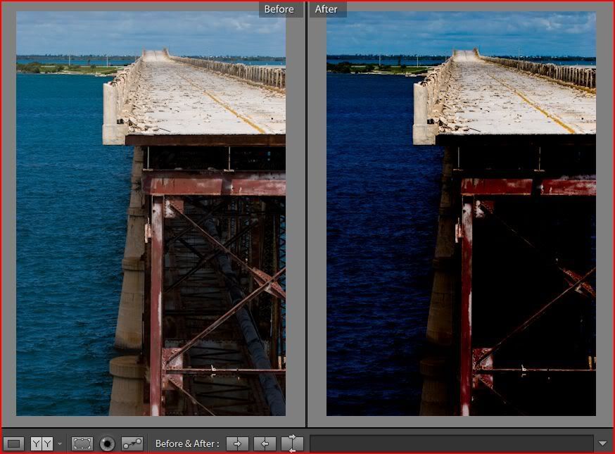
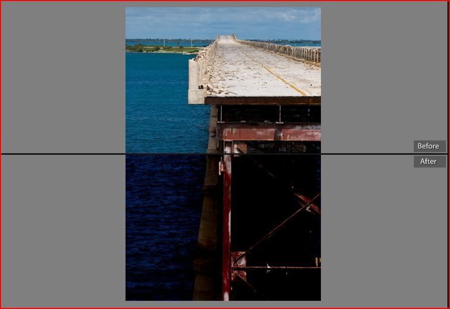
The next icon is the compare icon. This will let you compare the before and after views of the image you're editing. Clicking on that icon again will cycle through 4 ways to view the before and after. Side by side views, top and bottom and then a side by side and top and bottom where it splits the image in half and shows half with the before settings and half with the after.
Adobe Photoshop Lightroom Killer Tips » Before and After Previews
To get back to the main view click the left most icon.
Next is the crop icon. When you click this you also get a few new tools in the tool bar. You also get a grid overlayed on your image to help with straightening the image.

the icon next to the word crop allows you to drag out a crop area on the image. I've never used this tool until just now and I will never use it again. it's much easier to just go up to the image and drag the corner anchors or one of the anchors along the sides.
The aspect ratio lock does two things. 1) it locks the aspect ratio in place so you are sure to keep that aspect. 2) if you click the small double arrow it will allow you to set a specific ratio such as 4x6, 8x10 or any custom ratio you'd like.
To straighten your image you can do one of three things. If you hover your cursor just outside the image grid it will change to a double headed, curved arrow. When you click with this and drag it will rotate your image and you can rotate it until it's straight. Your second choice is to use the slider to theright and drag that which rotates your image as well. Btw, if you rotate the image and don't like it, just double click on the word straighten and it will reset your image to 0. this works on almost all the settings in lightroom including exposure, sharpening, contrast.... but the best way to straighten your image is the one I use. click the ruler and bring it into the image. Find anything that is supposed to be straight in the images, such as the horizon or the wall of a building and drag a line along that edge. When you release the button LR will automatically make that line straight which in turn will make the image straight. This works the same way as using the ruler in PS and then go to rotate the canvas arbitrarily.
If at any time you're totally screwed up, click the reset button to the far right.
Now click the left most button and get back to the main view.
Next to the crop icon is the red eye icon. I'm sorry but I honestly can't tell you how this works other than you click and drag an area around the eye. I have never used it and none of my photos get red eye so I can't even test it out. Here is a video on how to use this tool.
Adobe Photoshop Lightroom Killer Tips » Get the Red Eye Out
Next to the red eye icon is the remove spots icon. This works like the cloning or healing tools in PS. Once you click on that icon you have a choice between clone and heal. Clone will clone the sample area literally and heal will clone the same area but it will blend the healed area so that it looks more nature. Healing will attempt to retain the texture, color and brightness of the area you are healing. Next to those choices is the slider that lets you choose the size of the brush. Like PS you can also use the [ and ] keys to adjust the size. When you click the spot you want to clone or heal LR will automatically choose a sample point and you'll end up with two circles. The thinner one is the point you chose and the thicker one is the one LR chose to sample from. If you don't like where it chose to sample from you can simply drag that circle around until you find one that works. You'll see a live update in the healing/cloning point as you drag. If you decide to use a larger or smaller brush, just hover your mouse over the edge of the thinner circle and you will get a double headed arrow. Click and drag to pull the circle out larger or push it in smaller.
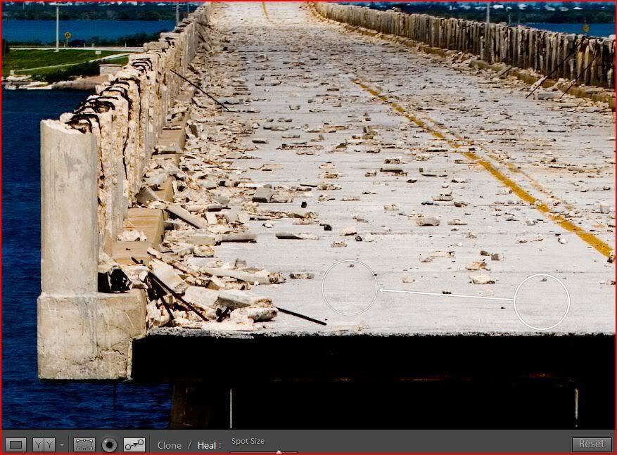
video
Adobe Photoshop Lightroom Killer Tips » Clone and Heal in Lightroom!
next to the remove spots icon you have the flags. Click the left one to flag the image as a pick and the right one to flag it as a reject.
Next to the flags are your navigation arrows. THIS is the set that lets you navigate forward and backwards through the filmstrip at the bottom.
Last is the zoom slider. This will go from fitting the image on the screen, all the way to 11:1 ratio. Anything over 1:1 is going to start giving you pixelation in the image. Also once you set this slider, the magnifying glass uses that setting when you click on the image with the magnifier tool. So if you set it to 4:1 for example and then click the image with the magnifier tool you will toggle between fit and 4:1. I just leave it at 1:1 and click on the image anytime I want to zoom in. there's really not a need in LR to go beyond 1:1 like there is in PS. Btw, there is also a set of zoom presets above the preview. Again, I never use them but they are there and they do reset how the magnifier tool works.
Ok, and finally the right tab. This is where 85% of your work will take place.
At the top is the histogram and this histogram is a working part of your editing. The first thing you'll notice is that it shows not only the over all histogram (the one in grey) but also all the colors that make up your image. The 3 base colors as well as the blended colors such as yellow, magenta and cyan. At the top of the histogram are the clipping warnings. The upward facing arrows at the top of the histogram are how you turn these warnings on and off, but you don't actually evne have to turn them on. If you just hover your mouse over the highlight warning (the top right arrow) your image will show a red overlay over anything that is blown out. Hovering the mouse over the shadows warning (the top left arrow) will show a blue overlay over anything that has gone completely black. You can of course click each of these if you want them on permanently but that can stop you from seeing parts of your image if you actually wanted to leave parts clipped.
At the bottom of the histogram you get your camera settings from the metadata. ISO speed, focal lenth, aperture and shutter speed are shown here.
Now here's the cool part and why this is a working histogram. Say you have an image and the histogram is showing a big spike in an area. You want to tone that spike down but you're not sure what slider to use. If you hover your mouse over that area in the histogram you will see at the bottom (where the camera settings usually are) what slider affects that area. Blacks, fill light, exposure or recovery.
Below your histogram is the basic pallet. At the very top is the treatment of the image and you have a choice between color or grayscale. Choosing grayscale will automatically turn your image to a black and white.
Below the treatment is the eyedroper used to set your white balance. Clicking the eyedroper removes it from it's dock and you can click around the image to set the white balance. While moving around you get a view of the area it's sampling and info at the bottom that shows the R, B and G values so you can find a neutral color. It also remember shows what the image will look like if you click in any area in the preview image in the top left.
To the right of the eye dropper is some presets for the WB. If you show in JPG you'll just have as shot, auto and custom. custom comes up automatically if you use the eye dropper or the sliders. If you shot the image in RAW you'll have all the same settings as you would in the camera. sunny, cloudy, indoors, shadow...
Adobe Photoshop Lightroom Killer Tips » White Balance
The sliders are for Temp and Tint. The Temp adjusts the blue/yellow and the tint adjusts the green/magenta. I've used the sliders much more than I've used the eyedropper or the presets.
Next you've got the ton adjustments. There is an auto button but this is another thing I just don't use. Sometimes it gets it right and other times it's just way off.
The first slider here is the exposure. This of course will ajust the overall exposure of the image.
Next is the recovery slider. This slider is magic and can bring back a lot of blown out highlights without making the rest of the image too dark.
Below recovery is the fill light. This works in the opposite way as recovery and will open up areas that have been made too dark do to the camera settings or do to adjustments you made above. It will open up the shadows without making the brighter areas any brighter.
Last is the blacks. This affects the darkest areas of the image and should be used sparingly. A little goes a long way on this slider.
Brightness again lightens or darkens the overall image but it works mainly on the mid tones and therefore won't blowout the brightest areas or send the darkest areas to black.
The contrast slider works as usual and I RARELY use this slider. The clarity slider works much better.
Clarity adds contrast to your image but it does it in a different way. For the best way to explain this, just go watch this video.
Adobe Photoshop Lightroom Killer Tips » Video - Behind the Scenes with Clarity
vibrance is another magical slider. This one is basically a smart saturation adjustment that wil help boost flat colors without oversaturating colors that are already saturated.
Below that is the old saturation slider which does exactly what you'd expect. It will saturate or desaturate your image.
To learn about the tone curve just watch this video. It will do much more for you than I can.
Adobe Photoshop Lightroom Killer Tips » Learning about the Tone Curve
HSL / Color / Grayscale
Adobe Photoshop Lightroom Killer Tips » Selectively Improving Colors
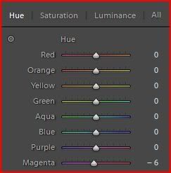
The HSL and Color sections do the same thing but they give you different views to work with. Under HSL you have at the top the choice to work with the Hue, the Saturation or the Luminance of the colors. Choosing any of these gives you the list of colors and as you adjust the slider for each color you will adjust one of the above settings depending on which you are set on. For example if you click Hue and then move the blue slider you will change the hue of just the blues. If you had chosen the saturation and you moved the blue slider you would be changing the saturation of just the blues in the image. Btw, I'd also like to note that if you click on the little bullseye looking icon in the top left corner of the HSL pallet you can then go into the image, click in the area that you want to change and drag up or down to change only the sliders that will affect that area. This also works in the Tone curve area.
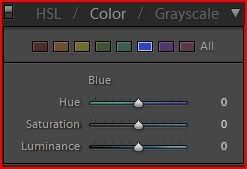
clicking on the Color again will do the same thing but it gives you a different view. Here you will choose a color icon and you will then have the 3 sliders under that. Hue, Saturation and Luminance.
you can also click the all in either of these views to give you every adjustment view at the same time, but personally I find that too much information to look at at once so I leave it as is.
Split Toning is the next Pallet down and works mainly on black and white images. Although you can do this on color it really wouldn't make much sense. On a black and white image this gives you the ability to add some color into the mix and even goes a step farther by letting you add two different colors. You have the highlights and the shadows split into two sections and each gives you the ability to choose a hue or color you want and the saturation of each. If you do use this I recommend cranking the saturation up as high as it will go to pick your hue and then sliding it back down to a setting you like after you have the hue picked out. Between these sections is the balance slider and this one basically lets you choose the balance between which part has a more dominant affect on the image. Sliding it to the left will show more of the shadow color and dragging it to the right will show more of the highlights. There is a good video out there on this but I can't find it right now. I'l update this once I do.
Next is the noise reduction and the shapening. It's important to note right now that you MUST be viewing the image at 100% to be able to view the affect this has on your image. It has to do with lightroom being able to update the previews and this and that, but basically just makes lightroom faster by doing it this way.
The noise reduction works pretty much the same way as any other program you've probably used. It has the luminance slider and the color slider. The color slider works mainly on those little green and red artifacts you see sometimes and the luminance works on the grainyness that you see in noisy images. These work pretty well but they do give you a water color effect if you over do it so just keep an eye on that.
The sharpening works great in the newer versions of lightroom. Here's a video on how it works which can probably do much better at explaining it than me trying to write it out.
Adobe Photoshop Lightroom Killer Tips » Video Tip - Sharpening in 1.1
Lens corrections is something you may or may not need. The CA part is good if you've got a cheap lens or if you are shooting in high contrast areas. CA is the purple or red fringing you will see along high contrast edges on some photos. If you look along the man's back in the image below you will see the CA in this shot.

Lens Vignetting is when you see an image where the edges or corners are darkened. This can happen for a number of reasons but one of the biggest is when you use a super wide angle lens and the lens hood or even a filter screwed onto the lens basically gets in the way. By using the amount slider you can drag to the left to darken or to the right to brighten the edges and corners. By using the midpoint slider you can tell LR to move the amount more towards the center by sliding it to the left or to restrict the amount to just along the edges by sliding it to the right. The one nice thing that all of us can use this for is to actually add vignetting to a properly exposed image. This works great on portraits to darken the corners and edges which causes the views eye to be drawn to the center of the image and your subject.
Camera Calibration I've never used but you can use it if your camera say has a tendancy to cause a red shift on all your images. You can adjust this to cancel that out and it will be applied to every shot you take with that camera.
At the very bottom you have two buttons. The Previous button lets you apply all the settings you applied to the previous image to the current image. The reset button will reset all your settings that you've made and lets you start from scratch.
One last note I wanted to make is that you can shift click or control click on several images in the film strip and then make changes to all those images at the same time. This comes in handy if you've got several images that need a white balance shift or a bump in exposure. Also, on the left side tab you have a copy and paste button. The copy and paste lets you copy all or just selcted settings that you've made to one image and paste them onto one or more of your other images.
Above is a screen shot of my screen in the develop module. The ony thing you might notice is that I customized the identity plate at the top. To do that, go to Edit > Indentity plate settings. In there you just set it to custom and then type what you want. Editing the text is no different than doing it in any other text program such as Word, Photoshop, notepad...
Adobe Photoshop Lightroom Killer Tips » Customizing Your Identity Plate
on the left you have 4 fields. The first at the top is the preview. It might seem stupid to have that small preview when you've got that huge working area but there's two very good reasons for that. First, if you zoom in on your main image you can use that preview to navigate around. The second is a nice feature they added into lightroom. Below the preview is a light of presets. You have default presets that come with lightroom and then user presets that you can save as you work. If you hover your mouse over those presets the preview will display what they will look like. This also works the same way when you're using the white balance eye dropper. The image below shows me zoomed in and hovering over one of the default presets. Note the preview is black and white even though my image is still in color. Also note the small box in the preview that is used to navigate around the photo.
if you are working on a photo and fine a nice combination of settings that you think you'll use on future images just click the + to the right of presets and that will allow you to save your settings and give your new preset a name. It will be saved under the user presets.
Adobe Photoshop Lightroom Killer Tips » Monday Video - Loading New Develop Presets
Below presets is the snapshot field. Considering that all edits in LR are soft edits, meaning there are no actual pixles being changed until you export, I really don't think this is needed but I guess someone did. What the snapshot does is to take a snapshot of the image you're editing as it is and saves it at those settings. So if you think you might want to try the image as a black and white after you've spend an hour editing the image you can click the + in that field to take a snap shot of the image and give that snapshot a name. Change it to black and white, continue editing for another hour and when you decide you just don't like it and want to go back to before you changed the photo to black and white you just click your snapshot.
Below the snapshots is the history area. This works just like the history pallet in photoshop. It will save a set amount of edits so that you can step back at any time. Sort of the same thing as the snapshot does only it can do that and more. I believe there is a way to set how many history states it will keep but for the life of me I can't find how.
I'll keep working on it.The bottom of the screen has many things but to be honest I usually have that one hidden. Btw, just like in the library module, you can hide any of the tabs by clicking the small arrows along their edges.
The first icon along the bottom will take you back to the library grid view. Pretty much the same thing as clicking....uh, library.
The second is a pair of arrows. You'd think these would take you forward and backwards through the film strip but they actually work more like the forward and back arrows on a web browser. They take you to the previous or the next view you were in. I can't explain why and again, this tab is usually minimizd so I have never asked.
Next is the folder location and file name. This can be an easy way to find where the photos you are editing actually live and what the file name is. If you actually want to go to that folder, right click on the image and choose show in explorer.
Down to the right are all the filter icons. There all work the same way but will filter the images you are working on depending on how you want to filter them and how you originally labeled, flagged or rated them. The first three are the flagged, not flagged and rejected flags. The next set are the star ratings, from 1 5. next are the color labels and at the end are the virtual copies and the master images.
At the very bottom under all these icons is the film strip which of course shows all the images you are working on.
In the center you have your main viewing/working area. There's of course the main image but below that are your editing tools.
The left most icon will always bring you back to the main view that you see in the images above.
The next icon is the compare icon. This will let you compare the before and after views of the image you're editing. Clicking on that icon again will cycle through 4 ways to view the before and after. Side by side views, top and bottom and then a side by side and top and bottom where it splits the image in half and shows half with the before settings and half with the after.
Adobe Photoshop Lightroom Killer Tips » Before and After Previews
To get back to the main view click the left most icon.
Next is the crop icon. When you click this you also get a few new tools in the tool bar. You also get a grid overlayed on your image to help with straightening the image.
the icon next to the word crop allows you to drag out a crop area on the image. I've never used this tool until just now and I will never use it again.
it's much easier to just go up to the image and drag the corner anchors or one of the anchors along the sides. The aspect ratio lock does two things. 1) it locks the aspect ratio in place so you are sure to keep that aspect. 2) if you click the small double arrow it will allow you to set a specific ratio such as 4x6, 8x10 or any custom ratio you'd like.
To straighten your image you can do one of three things. If you hover your cursor just outside the image grid it will change to a double headed, curved arrow. When you click with this and drag it will rotate your image and you can rotate it until it's straight. Your second choice is to use the slider to theright and drag that which rotates your image as well. Btw, if you rotate the image and don't like it, just double click on the word straighten and it will reset your image to 0. this works on almost all the settings in lightroom including exposure, sharpening, contrast.... but the best way to straighten your image is the one I use.
click the ruler and bring it into the image. Find anything that is supposed to be straight in the images, such as the horizon or the wall of a building and drag a line along that edge. When you release the button LR will automatically make that line straight which in turn will make the image straight. This works the same way as using the ruler in PS and then go to rotate the canvas arbitrarily. If at any time you're totally screwed up, click the reset button to the far right.
Now click the left most button and get back to the main view.
Next to the crop icon is the red eye icon. I'm sorry but I honestly can't tell you how this works other than you click and drag an area around the eye. I have never used it and none of my photos get red eye so I can't even test it out. Here is a video on how to use this tool.
Adobe Photoshop Lightroom Killer Tips » Get the Red Eye Out
Next to the red eye icon is the remove spots icon. This works like the cloning or healing tools in PS. Once you click on that icon you have a choice between clone and heal. Clone will clone the sample area literally and heal will clone the same area but it will blend the healed area so that it looks more nature. Healing will attempt to retain the texture, color and brightness of the area you are healing. Next to those choices is the slider that lets you choose the size of the brush. Like PS you can also use the [ and ] keys to adjust the size. When you click the spot you want to clone or heal LR will automatically choose a sample point and you'll end up with two circles. The thinner one is the point you chose and the thicker one is the one LR chose to sample from. If you don't like where it chose to sample from you can simply drag that circle around until you find one that works. You'll see a live update in the healing/cloning point as you drag. If you decide to use a larger or smaller brush, just hover your mouse over the edge of the thinner circle and you will get a double headed arrow. Click and drag to pull the circle out larger or push it in smaller.
video
Adobe Photoshop Lightroom Killer Tips » Clone and Heal in Lightroom!
next to the remove spots icon you have the flags. Click the left one to flag the image as a pick and the right one to flag it as a reject.
Next to the flags are your navigation arrows. THIS is the set that lets you navigate forward and backwards through the filmstrip at the bottom.
Last is the zoom slider. This will go from fitting the image on the screen, all the way to 11:1 ratio. Anything over 1:1 is going to start giving you pixelation in the image. Also once you set this slider, the magnifying glass uses that setting when you click on the image with the magnifier tool. So if you set it to 4:1 for example and then click the image with the magnifier tool you will toggle between fit and 4:1. I just leave it at 1:1 and click on the image anytime I want to zoom in. there's really not a need in LR to go beyond 1:1 like there is in PS. Btw, there is also a set of zoom presets above the preview. Again, I never use them but they are there and they do reset how the magnifier tool works.
Ok, and finally the right tab. This is where 85% of your work will take place.
At the top is the histogram and this histogram is a working part of your editing. The first thing you'll notice is that it shows not only the over all histogram (the one in grey) but also all the colors that make up your image. The 3 base colors as well as the blended colors such as yellow, magenta and cyan. At the top of the histogram are the clipping warnings. The upward facing arrows at the top of the histogram are how you turn these warnings on and off, but you don't actually evne have to turn them on. If you just hover your mouse over the highlight warning (the top right arrow) your image will show a red overlay over anything that is blown out. Hovering the mouse over the shadows warning (the top left arrow) will show a blue overlay over anything that has gone completely black. You can of course click each of these if you want them on permanently but that can stop you from seeing parts of your image if you actually wanted to leave parts clipped.
At the bottom of the histogram you get your camera settings from the metadata. ISO speed, focal lenth, aperture and shutter speed are shown here.
Now here's the cool part and why this is a working histogram. Say you have an image and the histogram is showing a big spike in an area. You want to tone that spike down but you're not sure what slider to use. If you hover your mouse over that area in the histogram you will see at the bottom (where the camera settings usually are) what slider affects that area. Blacks, fill light, exposure or recovery.
Below your histogram is the basic pallet. At the very top is the treatment of the image and you have a choice between color or grayscale. Choosing grayscale will automatically turn your image to a black and white.
Below the treatment is the eyedroper used to set your white balance. Clicking the eyedroper removes it from it's dock and you can click around the image to set the white balance. While moving around you get a view of the area it's sampling and info at the bottom that shows the R, B and G values so you can find a neutral color. It also remember shows what the image will look like if you click in any area in the preview image in the top left.
To the right of the eye dropper is some presets for the WB. If you show in JPG you'll just have as shot, auto and custom. custom comes up automatically if you use the eye dropper or the sliders. If you shot the image in RAW you'll have all the same settings as you would in the camera. sunny, cloudy, indoors, shadow...
Adobe Photoshop Lightroom Killer Tips » White Balance
The sliders are for Temp and Tint. The Temp adjusts the blue/yellow and the tint adjusts the green/magenta. I've used the sliders much more than I've used the eyedropper or the presets.
Next you've got the ton adjustments. There is an auto button but this is another thing I just don't use. Sometimes it gets it right and other times it's just way off.
The first slider here is the exposure. This of course will ajust the overall exposure of the image.
Next is the recovery slider. This slider is magic and can bring back a lot of blown out highlights without making the rest of the image too dark.
Below recovery is the fill light. This works in the opposite way as recovery and will open up areas that have been made too dark do to the camera settings or do to adjustments you made above. It will open up the shadows without making the brighter areas any brighter.
Last is the blacks. This affects the darkest areas of the image and should be used sparingly. A little goes a long way on this slider.
Brightness again lightens or darkens the overall image but it works mainly on the mid tones and therefore won't blowout the brightest areas or send the darkest areas to black.
The contrast slider works as usual and I RARELY use this slider. The clarity slider works much better.
Clarity adds contrast to your image but it does it in a different way. For the best way to explain this, just go watch this video.
Adobe Photoshop Lightroom Killer Tips » Video - Behind the Scenes with Clarity
vibrance is another magical slider. This one is basically a smart saturation adjustment that wil help boost flat colors without oversaturating colors that are already saturated.
Below that is the old saturation slider which does exactly what you'd expect. It will saturate or desaturate your image.
To learn about the tone curve just watch this video. It will do much more for you than I can.
Adobe Photoshop Lightroom Killer Tips » Learning about the Tone Curve
HSL / Color / Grayscale
Adobe Photoshop Lightroom Killer Tips » Selectively Improving Colors
The HSL and Color sections do the same thing but they give you different views to work with. Under HSL you have at the top the choice to work with the Hue, the Saturation or the Luminance of the colors. Choosing any of these gives you the list of colors and as you adjust the slider for each color you will adjust one of the above settings depending on which you are set on. For example if you click Hue and then move the blue slider you will change the hue of just the blues. If you had chosen the saturation and you moved the blue slider you would be changing the saturation of just the blues in the image. Btw, I'd also like to note that if you click on the little bullseye looking icon in the top left corner of the HSL pallet you can then go into the image, click in the area that you want to change and drag up or down to change only the sliders that will affect that area. This also works in the Tone curve area.
clicking on the Color again will do the same thing but it gives you a different view. Here you will choose a color icon and you will then have the 3 sliders under that. Hue, Saturation and Luminance.
you can also click the all in either of these views to give you every adjustment view at the same time, but personally I find that too much information to look at at once so I leave it as is.
Split Toning is the next Pallet down and works mainly on black and white images. Although you can do this on color it really wouldn't make much sense. On a black and white image this gives you the ability to add some color into the mix and even goes a step farther by letting you add two different colors. You have the highlights and the shadows split into two sections and each gives you the ability to choose a hue or color you want and the saturation of each. If you do use this I recommend cranking the saturation up as high as it will go to pick your hue and then sliding it back down to a setting you like after you have the hue picked out. Between these sections is the balance slider and this one basically lets you choose the balance between which part has a more dominant affect on the image. Sliding it to the left will show more of the shadow color and dragging it to the right will show more of the highlights. There is a good video out there on this but I can't find it right now. I'l update this once I do.
Next is the noise reduction and the shapening. It's important to note right now that you MUST be viewing the image at 100% to be able to view the affect this has on your image. It has to do with lightroom being able to update the previews and this and that, but basically just makes lightroom faster by doing it this way.
The noise reduction works pretty much the same way as any other program you've probably used. It has the luminance slider and the color slider. The color slider works mainly on those little green and red artifacts you see sometimes and the luminance works on the grainyness that you see in noisy images. These work pretty well but they do give you a water color effect if you over do it so just keep an eye on that.
The sharpening works great in the newer versions of lightroom. Here's a video on how it works which can probably do much better at explaining it than me trying to write it out.
Adobe Photoshop Lightroom Killer Tips » Video Tip - Sharpening in 1.1
Lens corrections is something you may or may not need. The CA part is good if you've got a cheap lens or if you are shooting in high contrast areas. CA is the purple or red fringing you will see along high contrast edges on some photos. If you look along the man's back in the image below you will see the CA in this shot.
Lens Vignetting is when you see an image where the edges or corners are darkened. This can happen for a number of reasons but one of the biggest is when you use a super wide angle lens and the lens hood or even a filter screwed onto the lens basically gets in the way. By using the amount slider you can drag to the left to darken or to the right to brighten the edges and corners. By using the midpoint slider you can tell LR to move the amount more towards the center by sliding it to the left or to restrict the amount to just along the edges by sliding it to the right. The one nice thing that all of us can use this for is to actually add vignetting to a properly exposed image. This works great on portraits to darken the corners and edges which causes the views eye to be drawn to the center of the image and your subject.
Camera Calibration I've never used but you can use it if your camera say has a tendancy to cause a red shift on all your images. You can adjust this to cancel that out and it will be applied to every shot you take with that camera.
At the very bottom you have two buttons. The Previous button lets you apply all the settings you applied to the previous image to the current image. The reset button will reset all your settings that you've made and lets you start from scratch.
One last note I wanted to make is that you can shift click or control click on several images in the film strip and then make changes to all those images at the same time. This comes in handy if you've got several images that need a white balance shift or a bump in exposure. Also, on the left side tab you have a copy and paste button. The copy and paste lets you copy all or just selcted settings that you've made to one image and paste them onto one or more of your other images.