Digital Painting for newbs?

  • Thread starter texshred777
  • Start date
  • This site may earn a commission from merchant affiliate links like Ebay, Amazon, and others.

texshred777

Well-Known Member
Joined
Dec 1, 2011
Messages
1,322
Reaction score
61
Location
Austin, TX
Repost-Originally posted in electronics/computers/it/gaming area-

I've had CS4 and a Wacom tablet for a little while now, but Illustrator and Photoshop are a bit overwhelming for a newb. I'm also colorblind, so building/picking colors is a bit more difficult for me than they might be for someone else.

I've seen a few at DeviantArt, but most are geared towards people who are pretty familiar with the programs already.

I'm good with either online articles, videos or even good books on the subject.

I've also picked up a first generation iPad and getting Sketchbook Pro to go with it. I know it's not as powerful as CS4 but it'll be nice to have a portable sketchbook with decent tools built in and not have to carry around a sketchbook, pencils, markers, etc. My Wacom isn't touch sensitive anyway, I'll just set opacity manually.

If anyone here is fluent or at least proficient with digital painting/drawing could you give me some good tips to start off with?

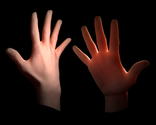
There's a few things in particular I've wondered about. Getting a good flesh tone, replicating metallics and giving fabrics/material texture.
 

This site may earn a commission from merchant links like Ebay, Amazon, and others.

Alimination

Space Adventurer
Joined
Apr 27, 2011
Messages
978
Reaction score
209
Location
NV
I'll give you a few tips for now. Have to leave my computer in a bit.

For flesh tone, keep in mind that the skin is kind of transparent and has multiple layers going through. My best advice is to grab a photo of a person and use the "eye drop tool". You will notice that a skin isn't just a light orange color (depending on the skin tone of course), but has some reds, violets, blues in different areas from the blood in your face.

Keep that skin layer in mind and remember that the areas like your nose or ear have more noticeable subsurface scattering going on. So behind the sun it be more red compared to other parts of the body. This can also be applied to Leaf or candles.

I will add more later!

Sub-Surface-Scattering-Example.jpg
 

texshred777

Well-Known Member
Joined
Dec 1, 2011
Messages
1,322
Reaction score
61
Location
Austin, TX
I'll give you a few tips for now. Have to leave my computer in a bit.

For flesh tone, keep in mind that the skin is kind of transparent and has multiple layers going through. My best advice is to grab a photo of a person and use the "eye drop tool". You will notice that a skin isn't just a light orange color (depending on the skin tone of course), but has some reds, violets, blues in different areas from the blood in your face.

Keep that skin layer in mind and remember that the areas like your nose or ear have more noticeable subsurface scattering going on. So behind the sun it be more red compared to other parts of the body. This can also be applied to Leaf or candles...

I will add more later!

Thanks, bro. With my red/green issues my characters always end up looking dead or lobster-like. They look fine to ME, but other's always find it slightly humorous.

I appreciate the help.
 

rahul_mukerji

Well-Known Member
Joined
Jul 13, 2006
Messages
422
Reaction score
119
Location
Rockville, Maryland, USA
Wow !! Okay how amazing is this ?
  • I'm technically colorblind too (yep, failed the Air Force test on that). And I've done umpteen number of tests after that and finally found I can't distinguish certain hues / colors.
  • I'm an artist too and have been for most of my life. I like painting.
  • I use iPad v01 and SketchbookPro too for my artwork.

Hello Sibling from another Building !!

Personally I think iPad w/ Sketchbook is a wonderful way to start. I too have a Wacom Tablet connected to my desktop, but its so much easier to work on my iPad.

I do cartoons. Here is what I do: Proviscocity

I would recommend just sitting in your spare time and drawing as much as you can and getting familiar with the tool. And then share it across to get feedback and find some honest artists who can critique your work (and that's constructive criticism and not demotivating sarcasm). This will help you grow and be more confident in your artwork.

Other than that just like the guitar, practice, practice and practice and then read, read, read.

If you need specific help you can always post questions and /or google them. I joined the ComicFury forum and I read tons on different artists technique and method and their perspective on color choices. I also put m stuff up for critiquing. The more I read the better my choices and therefore art gets.

Here is my method ! I use Sketchbook Pro on the iPad for the sketch and then Photoshop for the speech bubbles and composing the panels together. I don't do illustrations or any kind of real-life rendering so I can't comment on that kind of art.

Alimination does some insane stuff with zBrush and such tools so look for his advice on creating figures and such.

I decided to throw in some screenshots of the tool so people not familiar with it get to see some of its features. Its pretty decent for a starters tool for art :)

1. Open iPad
IMG_0178.PNG


2. Open Sketchbook Pro
IMG_0179.PNG


3. Blue Draft Lines
IMG_0180.PNG


4. Layers on the Tool
IMG_0181.PNG


5. Outlining
IMG_0182.PNG


6. Other Lines
IMG_0183.PNG


7. Colouring in the characters
IMG_0184.PNG


8. Adding a backdrop
IMG_0185.PNG


9. A Layer for details
IMG_0186.PNG


10. Tool Shot 1
IMG_0187.PNG


11. Tool Shot 2
IMG_0188.PNG


12. Gallery of images
IMG_0189.PNG


13. Export
IMG_0190.PNG


14. Export Options [Layers vs Flat file]
IMG_0191.PNG


15. Save File
IMG_0192.PNG


16. Add Speech bubble and lettering in Photoshop
IMG_0193.png


17. Compose the entire sketch in Photoshop
IMG_0194.png


18. Resize and export for the web and publish to ComicFury on desired Date !!!
 

mikernaut

pixel pusher
Joined
Dec 16, 2006
Messages
3,165
Reaction score
2,198
Location
Man FranDisco, CA
I initially replied when he posted in the gaming section, thought I'd repost my reply incase it helps anyone else out. :yesway:

One of my good buddies that I worked with at a studio is red/green color blind and he would sample flesh tones from photos with the eye dropper tool when doing digital painting just like Alimination mentioned.

Anyways a good starting point would be to download people's custom brush sets and go thru and try out each individual brush and see what it does and how it acts. You can find tons of different ones ..drybrushes, grunge, watercolor, some that even kinda of feel like wet oil paint.

A great brush set is Daarken's custom brushes that you can grab from his site- The Art of Daarken (under tutorials- my brushes)

Another one is "Blur's good brush set" if you can track that down, I have it and could email it to you if you want. Think it's compatible with CS4

When I work I use alot of different layers such as overlay , soft light, color burn and dodge and see how it effect the image as I go. (also adjusting the opacity slider too)
It's not uncommon for me to end up having 100 layers when I'm done.

I usually start with a colored back ground to kind of go for an overall tone or mood. Then rough out a character with a warm 50% grey to sort of build it up to get some foundation of form. When I'm happy with the proportions and what I have then I will start adding color with layers. So it's sort of like adding color tones on top of a greyscale pencil drawing. I also will incorporate photographic elements or texture scans to help build up some areas. Mainly more for metal and mechanical/ techy stuff, grunge layers, etc. The trick is to try and blend it in seamlessly with the painting.

It's all a learning process as to what works for you. Not the most intensive tutorial but I did do this one awhile back. Resident Evil Rebecca with Tutorial - CGHUB Forum

Theres tons of great tutorials out there on art sites and youtube
 

texshred777

Well-Known Member
Joined
Dec 1, 2011
Messages
1,322
Reaction score
61
Location
Austin, TX
I picked up the Adobe Photoshop and Illustrator CS4 Classroom in a Book...books. Hopefully that'll help with getting a good hold on the various tools available.

I've read multiple times that using the eyedropper tool is a pretty often used way of getting realistic flesh tones. I'll do that but thought manually building colors is a good way to learn to overcome my visual shortcomings. Thanks for the tips keep em coming. I'm sure other newb Photoshoppers could learn something from you experienced guys.
 

texshred777

Well-Known Member
Joined
Dec 1, 2011
Messages
1,322
Reaction score
61
Location
Austin, TX
Rahul,

I learned of my color blindness when going into the military. I knew from an early age that I often confused purple for blue. Now I've come to realize that greens sometimes look gray, brown and green can sometimes look alike as well. Green traffic lights just look white to me and the red/yellows both look more orange to me and very similar.

Green seems to be more of a problem for me than red. Colors closer to the inside of the color wheel also get a little ambiguous for me.

It makes sense that I'd spent most of my artistic life being a pencil sketch artist, never really having a desire to color my work. I'd recently starting using gray scale markers with some Prismacolor pencils over the marker for color.
 

rahul_mukerji

Well-Known Member
Joined
Jul 13, 2006
Messages
422
Reaction score
119
Location
Rockville, Maryland, USA
Interesting. Your cb is a lot more severe than mine. I have an issue with hues. I've never officially got it checked but ever since I've failed the test I kept taking those book tests and now internet tests and I never "see" anything on those sheets. So I keep getting the result "colorblind" but no specifics.

I'm pretty sure I can see the primary colors and some of the hues, but I never know if the orange most people see is the same one I see or not.

Oddly enough, my art teacher always liked my color choices !! He said he could recognize a piece by me anywhere because of the color choices.

Its been an interesting life knowing I'm a color blind artist. Most of my friends are amused :scratch:
 

Alimination

Space Adventurer
Joined
Apr 27, 2011
Messages
978
Reaction score
209
Location
NV
First of all I just want to mention that sketchbook pro is an amazing program! There is totally nothing wrong with using it. I've seen some real high end work come out of that program!

----
Keep in mind photoshop and Illustrator are two different programs for complete different purposes.

Illustrator is more for creating vector art. Great for logos or stuff that you want to scale from as small as a business card to a billboard without blurring.
It's not ideal compared to sketching, or painting. It's pretty much a whole different subject to talk about.

As most of you guys mentioned, the best free way to learn photoshop has got to be from youtube. Even if it is just quick tips on a specific tool. I recommend using that first.
---

As for tips on metal. All I can say that it's about the hot spots on the highlights were the light is hitting the surface. The more smaller the highlight the more "glossy" it will look. You can mimic reflections by just taking samples off the image as a whole, place it over the metal surface, and lightly erase or lower the opacity.

For fabric, are you talking about fabric texture or how they fold?
For texture just grab yourself an image off google and plant them, you can always find fabric brushes off the web. Either way both get the job done.

For actually drawing folds I may recommend this book.

Amazon.com: Dynamic Wrinkles and Drapery: Solutions for Drawing the Clothed Figure (Practical Art Books) (9780823015870): Burne Hogarth: Books
 

Alimination

Space Adventurer
Joined
Apr 27, 2011
Messages
978
Reaction score
209
Location
NV
oh and I apologize, I don't know how to solve color blind thing.

There is a website from adobe called Kuler. Maybe this can help you pick out your colors?

kuler
 

texshred777

Well-Known Member
Joined
Dec 1, 2011
Messages
1,322
Reaction score
61
Location
Austin, TX
Thanks for the book recommendation, I've been pleased with Hogarthe's Dynamic figure drawing book so I'll check that one out too.

Also thanks for the input on Illustrator, I've had these programs for quite awhile but wasn't really sure when/why I'd use Illustrator over Photoshop.

I'm picking up a replacement pen for my graphics tablet tomorrow so hopefully I'll have something up for some critique in the next couple weeks.

I've seen a few videos up on youtube, most of which were speed drawings but watching the layering process has given me a little insight on building colors-even if I'm not schooled in the programs enough to know what selections/settings are being used for the layers.
 

texshred777

Well-Known Member
Joined
Dec 1, 2011
Messages
1,322
Reaction score
61
Location
Austin, TX
And about Sketchbook Pro w/ iPad-
I've seen a fair amount of self proclaimed(and hey, they may be telling the truth for all I know) pro artists commenting on blogs/articles knocking the setup as little more than a toy. That reminds me of an art teacher I had years ago who gave me shit for liking to use mechanical and drafting pencils for drawing(I love the .3mm)-"real artists don't use those"..what do you know many of my favorite artists in the comic/fantasy concept art arenas use mechanical and drafting pencils. It's the same elitism that claims a "real" guitarist won't use amp modelling. Enter Tosin Abasi.

I'm not implying the iPad can replace my Wacom tablet-it can't-but I've seen some really killer looking pieces created on the iPad using sketchbook pro. I wouldn't have made the choice to buy an iPad OVER a Wacom tablet, but it's nice to have both. The fat nibbed stylus will take some getting used to though...
 

Alimination

Space Adventurer
Joined
Apr 27, 2011
Messages
978
Reaction score
209
Location
NV
haha a tool is a tool mate, it doesn't matter what anyone says. :)


Looking forward to see your work!
 
Top